Metric Guide
What each Source Trace dashboard metric means, when to trust it, and where to look when it changes.
Coverage
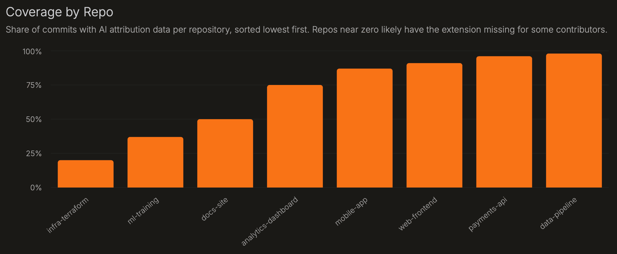
Coverage is the share of commits that are instrumented - where the Source Trace extension was active and recorded who wrote each line. It is the trust check for every other metric on this page. Below ~80%, survival, rework, agent, model, and repo comparisons can be biased. When Source Trace records a commit, it also counts the preceding commits made without it - so coverage reflects real gaps, not just the commits it saw.
| Chart | What it shows | How to interpret |
|---|---|---|
| Instrumented Commits | Share of commits that are instrumented (Source Trace recorded line authorship), over time. | Below ~80%, downstream metrics can be biased. A sudden drop usually means the extension stopped running for one or more contributors. |
| Coverage by Repo | Per-repo instrumented commit share, sorted lowest first. | Start here before reading repo metrics. A repo near zero usually means contributors are committing without the extension installed or signed in. |
Known limitation: code formatters can rewrite lines after an agent edits them. Because Source Trace tracks the files each agent actively edited, these changes are usually still attributed correctly - but large automated transformations run after an edit can blur attribution.
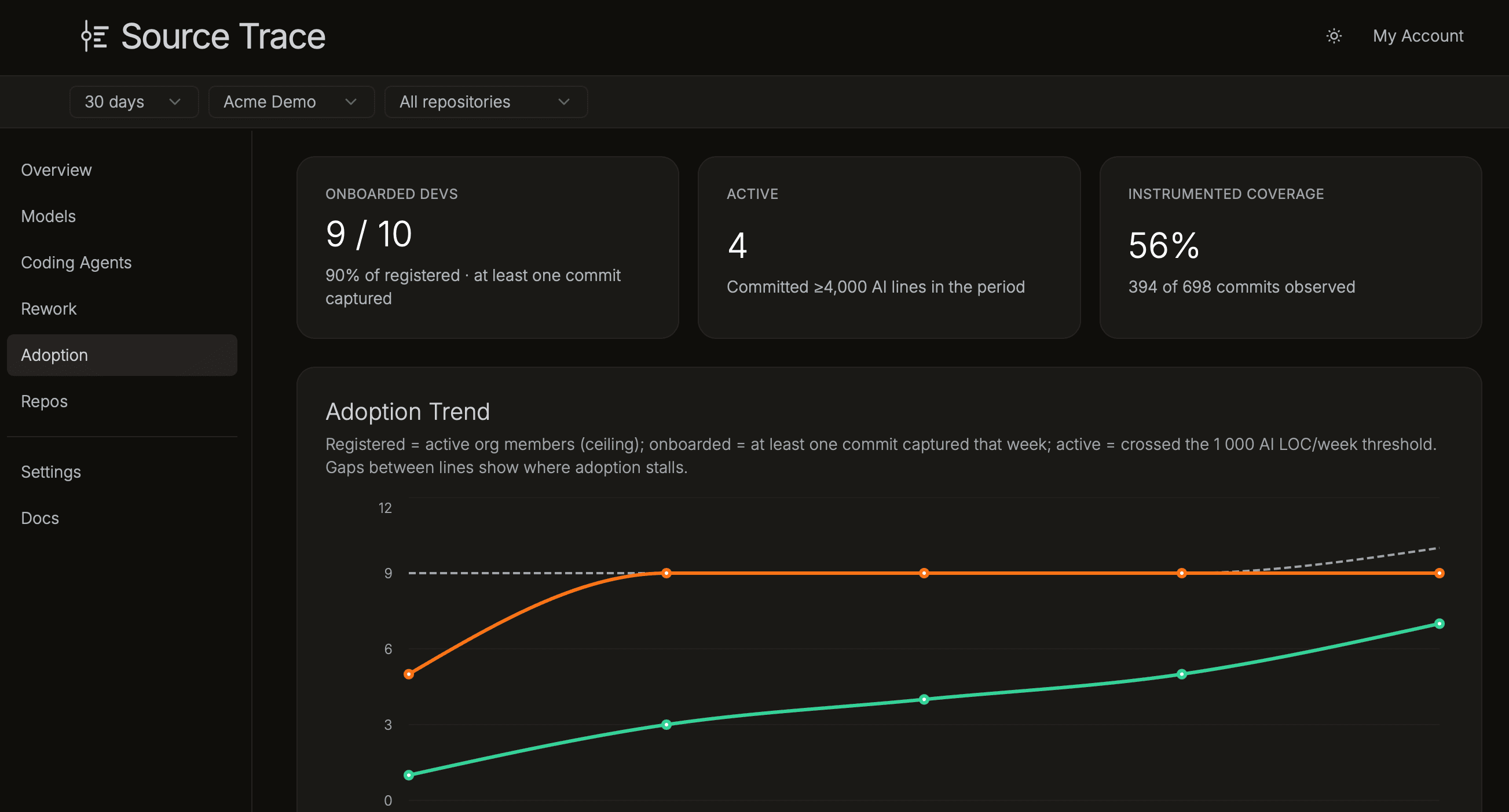
Adoption
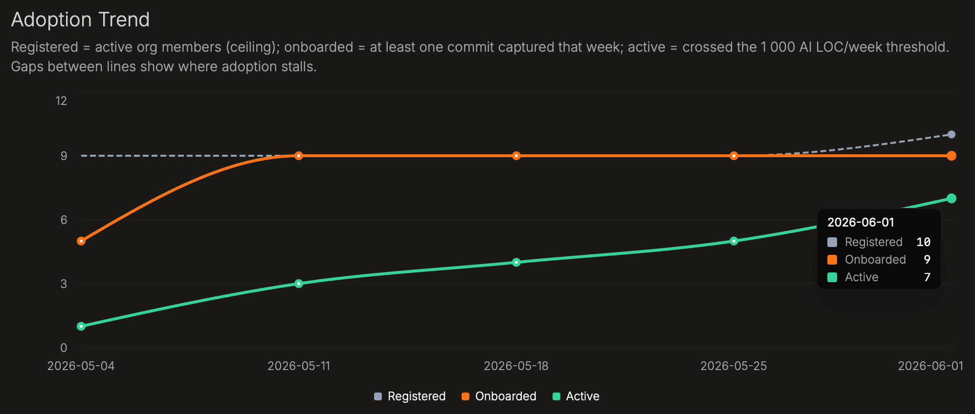
Adoption has three stages. Registered developers are on the org roster. Onboarded developers have had at least one commit captured by Source Trace: the extension is installed and working. Active developers have committed 1,000 or more AI-survived lines in a week. The funnel shows counts at each stage; the gaps show where rollout stalls.
| Chart | What it shows | How to interpret |
|---|---|---|
| Adoption Funnel | Developer count at each stage: Registered → Onboarded → Active. | The widest drop-off is the first place to investigate. Registered to Onboarded means developers are on the roster but haven't had a commit captured yet, usually an installation issue. Onboarded to Active means the tool is working but usage is occasional or low volume. |
| Adoption Trend | Registered, onboarded, and active developer counts over time. | Use this to see whether rollout is improving. A widening gap between Onboarded and Active means more developers have the tool working than are using it consistently. |
| Adoption by Team | Developers with survived AI lines per team. | Teams far below the org rate are candidates for onboarding; high-adoption teams are natural champions for rollout. |
| Frequency Heatmap | Survived AI lines per developer per week. | Consistently active rows signal steady, repeated use; sparse rows are occasional use or stalled onboarding. |
Rework
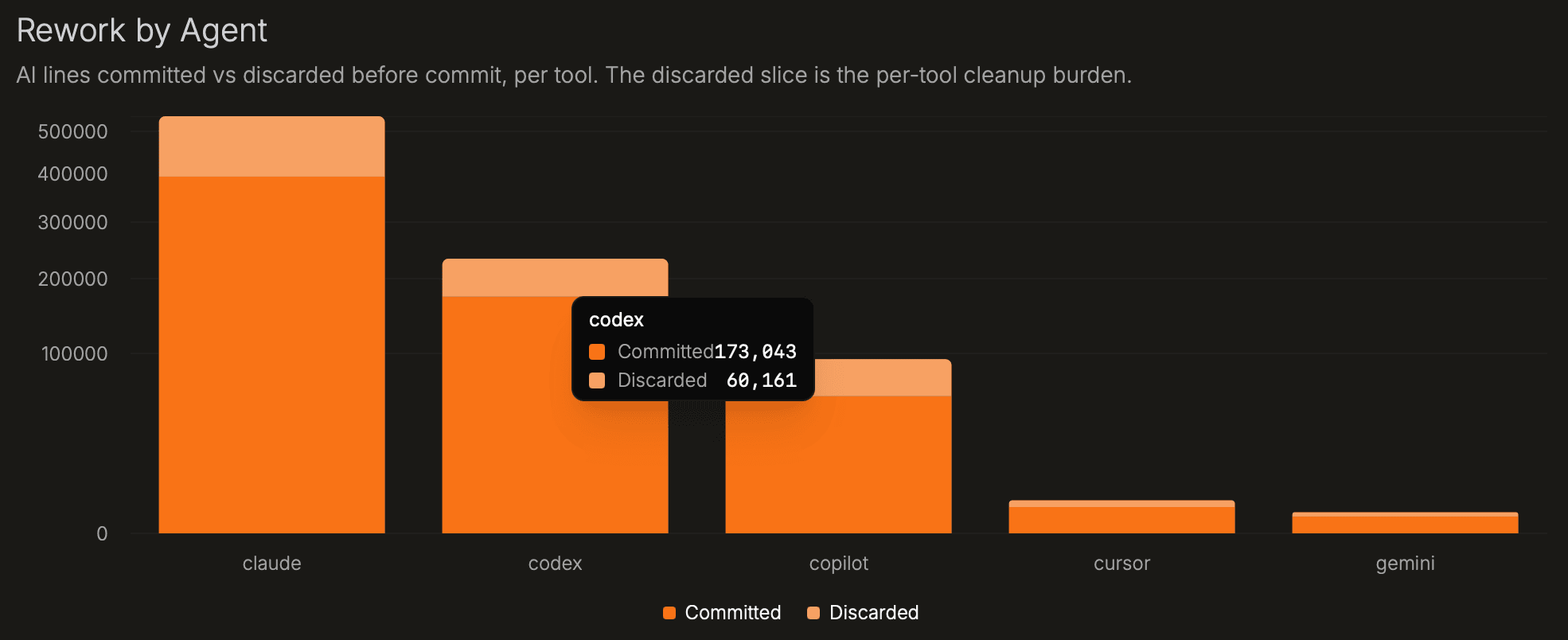
Rework measures what gets discarded before commit. Source Trace compares AI-written lines with the lines that survive into commits. High discard means developers are deleting or rewriting a large share of generated code before it reaches the repository.
Excess rework is AI discard rate minus the manual baseline, in percentage points. Positive excess rework means AI output needs more pre-commit editing than manually written code in the same repo or team. Treat it as an agent or workflow signal, not a developer score.
| Chart | What it shows | How to interpret |
|---|---|---|
| Rework Trend | AI lines survived vs. discarded before commit each week, alongside the manual baseline. | Converging discard rates mean AI output is approaching the manual baseline. A persistent gap means AI output requires more cleanup. |
| Rework by Agent | AI lines survived vs. discarded before commit, per agent. | The discarded slice is the cleanup burden. A large discarded bar for one agent means that agent's output needs more editing in your codebase. |
| Commit-Level Distribution | How many commits fall in each AI discard-rate band. | A spike at high discard is systemic rework; a long tail is occasional churn. Most healthy codebases cluster toward the left (low discard). |
| Excess Rework by Team | AI discard rate minus manual discard rate per team, in percentage points. | Positive = AI code needs more pre-commit editing than manually written code for that team. Teams without a manual baseline are hidden. |
| AI vs Manual Survival | Each point is a team, plotting AI survival rate vs. manual survival rate. | Below the diagonal = AI survives less than manual. Near the diagonal = similar discard behavior. Above = AI code is discarded less than manual code. |
Coding Agents
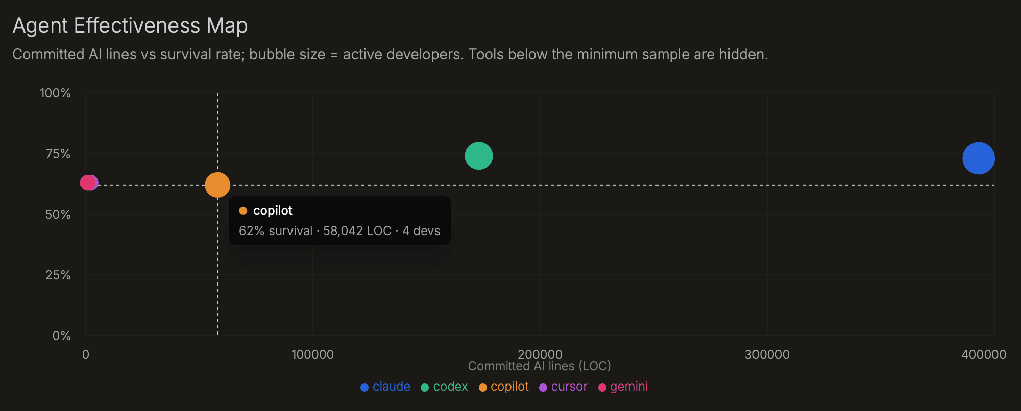
Agent adoption alone does not show value. An agent that writes a lot of code but has low survival is creating cleanup work. The effectiveness map puts adoption and survival in the same view, so you can compare agents only after coverage is high enough. Use it to decide where to standardize, coach, or retire agents.
Source Trace supports Claude, Codex, Copilot, Cursor, Gemini, Kilo Code, and OpenCode.
| Chart | What it shows | How to interpret |
|---|---|---|
| Agent Effectiveness Map | Active developers vs. survival rate per agent; bubble size = survived AI lines. | Top-right = broadly adopted with high survival. High adoption, low survival = cleanup burden. Low adoption, high survival = underused agent. |
| Written → Survived by Agent | AI lines written to disk vs. lines that survived to commit, per agent. | The gap is pre-commit rework. A large gap means developers are discarding a lot of output from that agent. |
| Agent Mix Over Time | Share of survived AI lines by agent, normalized to 100% per day. | Shows whether agent adoption is shifting. An agent losing share rapidly may have been deprecated, or developers may have found a better alternative. |
| Agent × Model Survival | Grid of agent (row) × model (column) cells; cell color = survival rate. | Cell label shows survived lines / written lines. Low-sample cells are greyed. Use this to find which agent+model combinations produce output that survives best in your codebase. |
Models
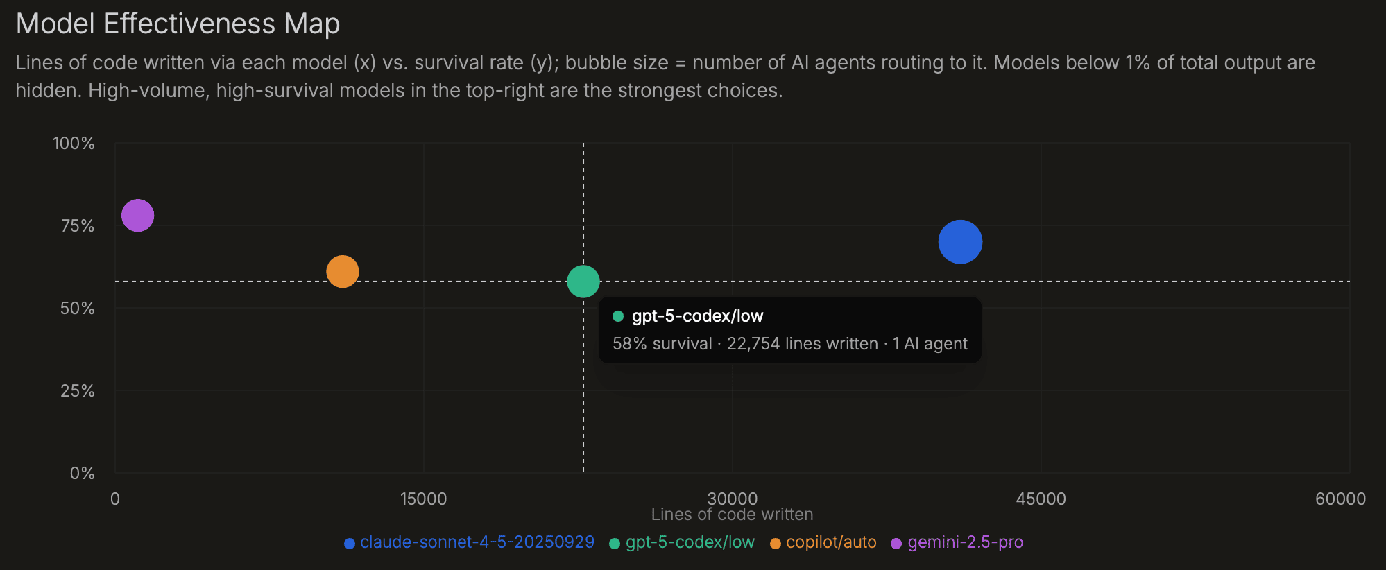
Models perform differently by task, agent, language, and repo. This page shows which models your agents are using and which combinations produce code that survives. Models below 1% of total AI-written lines are hidden because low-volume survival rates are noisy.
| Chart | What it shows | How to interpret |
|---|---|---|
| Model Effectiveness Map | Lines written per model (x) vs. survival rate (y); bubble size = number of agents routing to it. Models below 1% of output are hidden. | Top-right models are high-volume and high-survival. Bottom-right models are widely used but produce output that is often edited away. |
| Written → Survived by Model | AI lines written to disk vs. lines that survived to commit, per model. | The gap is pre-commit rework. Large gaps on high-volume models usually point to routing, prompting, or task-fit issues. |
| Model Share of Survived AI Lines | Each model's share of total survived AI lines across all agents. | Shows whether model distribution matches your intended routing policy. An unexpectedly high share may mean a default model is being used more than intended. |
| Agent × Model Survival | Grid showing survival rate for each agent + model combination. | The same model can perform very differently across agents. Use this to find which pairings work best for your codebase. |
Repos
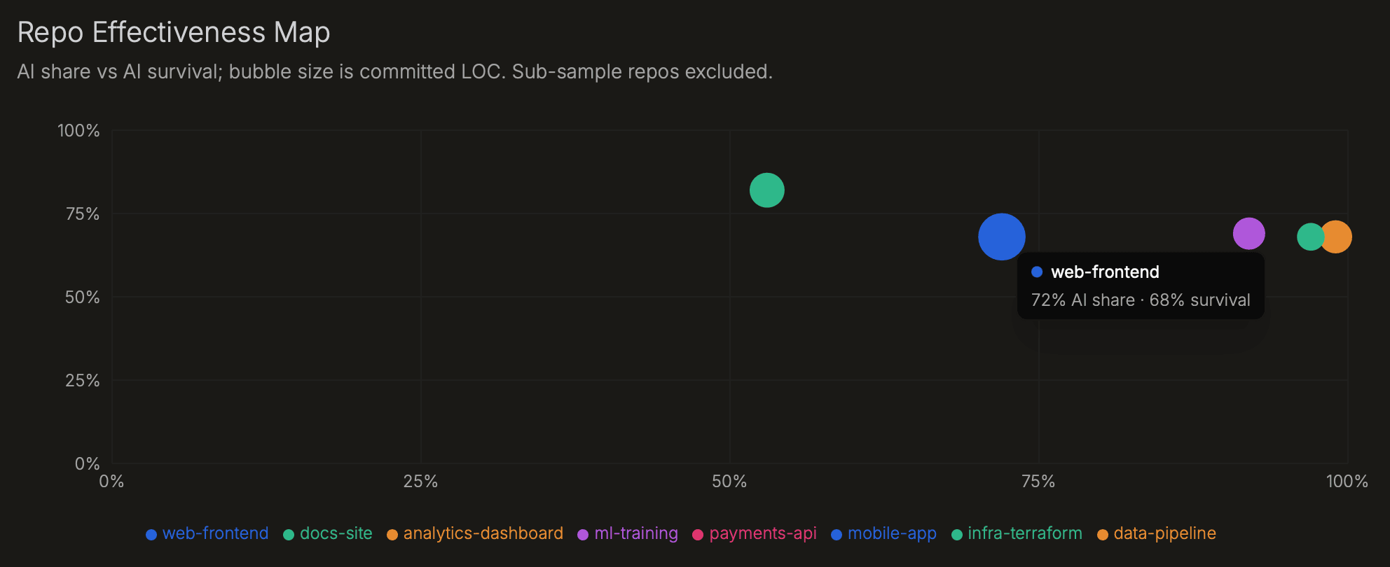
Repo metrics show where AI output survives and where it gets rewritten. High AI share with high survival signals a strong fit. High AI share with excess rework means developers are cleaning up AI output before commit. Check coverage by repo first; low coverage makes the rest of the repo view unreliable.
| Chart | What it shows | How to interpret |
|---|---|---|
| Repo Effectiveness Map | AI share vs. AI survival per repo; bubble size = survived lines. | High share + high survival = effective AI use. High share + low survival = AI output is being edited heavily before commit. Low-sample repos are excluded. |
| AI Share by Repo | AI share of survived lines per repository over time. | Growing AI share alongside stable survival indicates effective adoption. Flat or declining share may mean the extension isn't deployed for all contributors. |
| Excess Rework by Repo | AI discard rate minus manual discard rate per repo, in percentage points. | Positive = AI code needs more pre-commit editing than manually written code in that codebase. Use this alongside the repo × agent matrix to find whether the issue is agent-specific. |
| Repo × Agent Matrix | Survival rate for each repo + agent combination. | An agent that performs well overall but poorly in one repo signals a codebase-specific fit issue - language, style, or task type. |
| Coverage by Repo | Share of instrumented commits per repository, sorted lowest first. | Start here for any repo where other metrics look off. Near zero = extension missing for some contributors in that codebase. |